|
Chapter 13
Interacting with
Objects and ActiveX Controls
YesterChapter's lesson covered HTML forms and the intrinsic controls that give the
form its usefulness. For some of you, the lesson may have been a refresher; for others,
it may have served as an introduction. Whatever the case, you now have a foundation
with which to explore more advanced objects and controls. In a continuing effort
to design the killer app, I think you will find these advanced objects a perfect
addition to your Web toolbox. The objects and controls that are discussed in this
lesson enable you to build a more effective and interactive interface for the user.
By using these objects in your application, you can design an application that truly
accomplishes its purpose while providing a rich and rewarding experience for the
user.
The first part of the lesson provides an overview of objects. The lesson explains
the concept of objects and provides a basic definition to serve as a foundation for
the rest of the Chapter. You then receive an introduction to Java applets. This introduction
will focus mainly on the purpose of Java applets and how they can be incorporated
into your Visual InterDev application.
Next, you are introduced to ActiveX controls. Because Visual InterDev includes
many ActiveX controls, most of the lesson focuses on ActiveX controls and technology.
The lesson first provides an ActiveX overview. Then you are given an in-depth tour
of the HTML Layout Editor. You discovered this editor when you built an application
on Chapter 4, "Creating Your First Visual InterDev Application." In toChapter's
lesson, you learn how to use the HTML Layout Editor to construct an interface based
on ActiveX controls. The final treatise for the Chapter unveils some of the more common
ActiveX controls that can be used with Visual InterDev. This section introduces you
to the controls that are included with Visual InterDev. On Chapter 15, "Integrating
Objects into Your Applications," you learn how to use these objects and controls
in your applications.
Object Overview
YesterChapter, you learned about HTML forms. You discovered that a form is comprised
of intrinsic controls that are an inherent part of HTML. These controls provide basic
functionality for your application. ToChapter's lesson extends the discourse to extrinsic
controls and objects, which also were defined yesterChapter. Extrinsic controls are external
to HTML and can be used to provide additional functionality to your application.
You will recognize some of the extrinsic objects and controls because they're
similar in name and purpose to HTML intrinsic controls. You also will discover new
and exciting controls that enable you to enhance the look and feel of your application.
All the extrinsic controls usually provide more functionality than their intrinsic
control brethren. ToChapter's lesson begins by declaring a definition of objects to provide
a good starting point for this lesson.
Defining Objects
The American Heritage Dictionary defines the word object in the following manner:
- 1. Something perceptible by the senses; a material thing.
2.A focus of attention or action.
3 The purpose of a specific action.
4.A noun that receives or is affected by the action of a verb or that follows
and is governed by a preposition.
Objects definitely provide a sensory experience for the user. You may not be able
to smell ob-jects, but you can definitely see and hear them. The second and third
definitions of an object mention that objects are the "focus" and "purpose"
of "attention or action." While the author of the dictionary might not
have considered Java applets or ActiveX controls when scripting this definition,
it can certainly be applied to these objects. The objects that you integrate into
your application become the "object" of the user's attention and actions.
Objects facilitate interaction between the user and your application. You can use
objects and controls to complement, supplement, and complete your application interface.
NOTE: During toChapter's lesson as well as
future lessons, I use the terms objects and controls almost synonymously to refer
to items that are placed on a web page to enable the user to perform some function.
Where necessary, I explicitly cite where an item is referred to solely as an object
or a control.
Now that you understand the definition of an object, it's time to examine two
of the most common types of objects--Java applets and ActiveX controls.
Introduction to Java Applets
Java applets are an integral component of the Internet both in name and in function.
Java applets are derived from the Java programming language developed by Sun Microsystems,
Inc. The biggest benefit of the Java language is its support for cross-platform development.
You can develop an applet or application with Java to support different client platforms.
The Java program will, in theory, execute in the same manner on both the Windows
95 platform and an Apple Macintosh, for example.
I mentioned that you can develop both applets and applications with Java. You
received an explanation about the difference between a Java applet and application
during the first week. As a reminder, applets are embedded in a web page and execute
within the context of a browser. The browser must support Java to be able to execute
the program. Java applications are executable programs that run independently of
any browser or other program. Because the theme for toChapter centers on using objects
in your web pages, this section focuses on Java applets.
NOTE: ToChapter's lesson as well as Chapter 15
focuses on the explanation, use, and integration of objects such as Java applets
and ActiveX controls into your Visual InterDev application. It is beyond the scope
of this guide to teach you how to build a Java applet. You will, however, learn how
to build an ActiveX control during the lesson on Chapter 16, "Building Design-Time
ActiveX Controls."
How Do Java Applets Work?
I mentioned that Java applets execute within the context of a browser. It's high
time you knew a little more about the interaction between the browser and a Java
applet. First, a user requests a certain web page. The HTML document is sent from
the web server to the browser on the client machine. If the browser detects a Java
applet embedded in the document, the browser requests the individual applet. The
browser detects the applet by discovering the <APPLET> tag within
the HTML document. The <APPLET> tag is covered in the next section.
The applet is distributed to the client machine in the form of bytecodes. The browser
interprets these bytecodes with the help of a Java runtime interpreter and executes
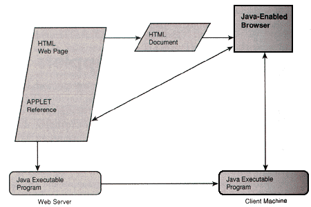
the applet program. Figure 13.1 visually depicts this process.
Figure 13.1.
Executing a Java applet.
As you can see, the process of using a Java applet is highly interactive. Good
communication between the client browser and the web server is paramount. The next
section explains how to define an applet and explain its basic attributes.
Understanding Java Applets
The basic tag to define an applet is the <APPLET> tag. This tag
is supported by the HTML 3.2 standard and enables you to insert an applet into an
HTML document. The syntax for using the <APPLET> tag is as follows:
<APPLET [CODEBASE="URL"] CODE="applet" [ALT="alternate text"]
[NAME="appletInstanceName"] WIDTH="nPixels" HEIGHT="nPixels"
[ALIGN="alignment"] [VSPACE="nPixels"] [HSPACE="nPixels"]>
As you can tell from the syntax, the only parameters required for inserting an
applet into a web page are the CODE, WIDTH, and HEIGHT
attributes. The following sections explain each of these parameters.
NOTE: The <APPLET> tag
is the HTML standard for referencing Java applets. Microsoft's browser, Internet
Explorer, supports the use of the <OBJECT> tag for inserting Java
applets into a web page. The <OBJECT> tag is covered in a later section
entitled "ActiveX Overview." Keep in mind that you can use either tag to
insert a Java applet into a web page.
CODEBASE
The CODEBASE attribute is an optional parameter that enables you to specify
the URL location of the applet code. The browser uses the web page document's URL
by default if this parameter isn't included. The browser uses this parameter to locate
the code for the applet after it realizes that the web page document contains an
applet.
CODE
The CODE attribute indicates the name of the compiled applet program
to be used with the web page. The syntax for referencing the applet is as follows:
<APPLET CODE="Applet.class">
Notice that the applet has a suffix of .class. This suffix is the standard
naming convention for Java applets. In this example, "Applet.class"
represents the applet code that will be executed within the context of the browser.
The file must be located either in the same directory as the HTML document or in
the URL directory that you specify using the CODEBASE attribute.
ALT
The ALT attribute enables you to provide alternate text to display for
browsers that cannot execute Java applets. This attribute is an optional parameter
for the <APPLET> tag. In these cases, the browser understands the
<APPLET> tag and recognizes its inability to process the applet code.
Given this scenario, the browser uses the ALT attribute to present the alternate
text to the user. The value of this attribute is a string of text enclosed within
quotes, as shown in the following line of code:
<APPLET CODE="Applet.class" ALT="I'm sorry. I don't do JAVA!">
NAME
The NAME attribute is an optional parameter that enables you to specify
an instance name for the applet. This attribute is useful for web pages that include
multiple applets on the same page. These applets use the instance name to communicate
with each other. Also, the instance name is used by scripting code to reference the
web page applet and its attributes.
A brief discussion about instances is warranted here. As you probably can tell
from some of the examples in this guide, I am a huge sports fan. I think sports can
be applied to any subject, even object-oriented programming. Without going into great
detail about Java and object-oriented concepts, I would like to give a sports analogy
to help explain a class instance.
Basketball is one of my favorite sports. When I think of the word basketball,
I form a mental picture of its color, shape, form, and function. In other words,
I recognize its attributes, purpose, and capabilities. I cannot take advantage of
the basketball or use it simply by contemplating its value. I must do something with
it.
A basketball at the local sporting goods store could be used to describe a Java
applet class. You and I both know the purpose of the basketball as it sits on the
shelf. I can't do something with the basketball until I go down to the store and
purchase it. Then, when I refer to my basketball, I can do something with it, like
shoot a three-point shot or perform a slam dunk. Just like the basketball, a Java
applet that has been developed has a defined purpose. It is not until I create an
instance of the applet in my web page that I can truly enjoy the benefits of the
program. The NAME attribute enables me to provide an instance name for referencing
the applet within the context of my application. For example, I could use script
code to extend the functionality of the applet. In my script code, I would use the
instance name to reference the applet.
WIDTH and HEIGHT
The WIDTH attribute is used to specify the width of the display area
for the applet measured in number of pixels. The HEIGHT attribute indicates
the height of the applet display area and also is measured in number of pixels. These
parameters are required. The following line of code provides an example of specifying
the width and height for an applet:
<APPLET CODE="Applet.class" WIDTH=250 HEIGHT=200>
ALIGN
You can use the ALIGN attribute to indicate the alignment for the applet.
This attribute is an optional parameter of the <APPLET> tag. The valid
values for this attribute include left, right, middle,
absmiddle, texttop, baseline, bottom, and absbottom.
The ALIGN attribute and its alignment values are similar in nature to that
of images. You can use the ALIGN attribute to specify the layout and alignment
of the applet in relation to the rest of the content for the web page.
VSPACE and HSPACE
The VSPACE attribute defines spacing in terms of pixels above and below
the applet. The HSPACE attribute defines spacing to the left and right of
the applet. The HSPACE attribute also is measured in terms of pixels. These
attributes are similar to their <IMG> tag brethren.
Using Parameters with Java Applets
Most applets use parameters to establish values for the applet's properties and
attributes. You can supply these parameters when the applet is loaded into the web
page. The syntax for supplying applet parameters is as follows:
<PARAM NAME="appletParamName" VALUE="appletParamValue">
appletParamName is the name of a parameter for the applet, and appletParamValue
is the value to be supplied to the applet. The following code sample demonstrates
an example of using parameters with an applet.
<APPLET CODE="NervousText.class WIDTH=400 HEIGHT=100>
<PARAM NAME="Text" VALUE="This text shakes!">
This example uses the Nervous Text applet and defines the width and height to
400 and 100 pixels respectively. The Nervous Text applet contains the Text
parameter which is set to "This text shakes!" in the example.
You should notice that the parameter name is specified, as well as the value for
the parameter.
ActiveX Overview
The other Chapter I was recalling the first time I used a Visual Basic control, which
was the Grid control included with Visual Basic 1.0. Controls have progressed tremendously
since the old VBX Chapters. Microsoft now provides users with a new kind of control--the
ActiveX control. In an effort to keep up with this fast-paced world, Microsoft has
built all their products to be active--Active Server, Active Documents, Active Server
Pages, and ActiveX controls, just to name a few. Just as OLE controls replaced the
VBX controls, ActiveX controls are currently the new kid on the block.
You can use ActiveX controls to build a dynamic and interactive interface for
your client-server or Web-based application. The ability to integrate ActiveX controls
into a web page without a lot of overhead gives these controls their new and improved
name. These controls are ideal for using over the Internet and the Web. ActiveX controls
basically enable you to provide a dynamic interface for a user to interact with your
application. ActiveX controls are similar in purpose to Java applets and HTML form
controls. In fact, some ActiveX controls have the same name as the HTML form controls
that you learned about yesterChapter. ActiveX controls are much more robust, as you will
discover on Chapter 15.
Understanding ActiveX Controls
Many ActiveX controls exist on the market. These controls have been developed
by Microsoft as well as third-party software vendors. Independent developers such
as yourself also have developed their own custom ActiveX controls and made them available
for use by Web and client-server developers. ActiveX controls can be inserted into
a web page using the <OBJECT> tag. The attributes and parameters to
include an ActiveX control into a web page differ slightly for each control, but
Table 13.1 outlines the basic attributes that can be used to define all ActiveX controls.
Table 13.1. The <OBJECT> tag attributes for ActiveX controls.
| Attribute |
Description |
| CLASSID |
Unique identifier for the ActiveX control |
| ID |
Instance name of the ActiveX control |
| HEIGHT |
Specifies the height of the control |
| WIDTH |
Specifies the width of the control |
| ALIGN |
Specifies the alignment and placement of the control |
| HSPACE |
Defines the left and right margin around the control |
| VSPACE |
Defines the top and bottom margin around the control |
The following sections explain each of the attributes for the <OBJECT>
tag.
CLASSID
The CLASSID attribute represents the key to unlock the power of an ActiveX
control. The CLASSID, or class identifier, explains the implementation of
the control to the browser. In other words, the CLASSID helps the browser
identify the type of control contained within the web page. Once the ActiveX control
has been identified, the browser realizes the characteristics and behavior of the
control.
Every ActiveX control contains a unique class identifier. The CLASSID
consists of characters and numbers. The following example displays the class identifier
for a command button:
CLASSid="CLSID:D7053240-CE69-11CD-A777-00DD01143C57">
You may be wondering how the browser can interpret these characters. The CLASSID
is linked to an entry in the Windows registration database. The entry in the Registry,
in turn, points to the code for the ActiveX control.
TIP: You can locate the CLASSID
by its filename in the Windows Registry under HKEY_CLASSES_ROOT. You also
can look in the CLSID section of HKEY_CLASSES_ROOT in the Registry.
You also could use the CODEBASE attribute that was discussed in the previous
section concerning Java applets to specify the location of an ActiveX control. Remember,
this attribute enables you to indicate a URL address location for the object. In
the case of ActiveX controls, the browser downloads the ActiveX control to the web
page. As the browser downloads the ActiveX control, the control automatically registers
itself on the client machine.
NOTE: The more popular browsers enable
you to designate what kind of controls and content can be executed on the client
machine. These browser security options control the ability of an ActiveX control
to register itself and run on the client machine.
ID
The ID attribute basically refers to the instance of the object. You
use the ID attribute to refer to and access the properties and methods of
the control within your code. The ID provides a name for you to use when
communicating with the control. For example, man could be analogous to an object.
When you hear the word man, you instantly think of the basic characteristics of a
man. You wouldn't refer to a male friend of yours as man. You would communicate with
him by using his first name. In my case, you would refer to me as Mike. I am an instance
of the man object; therefore, my ID attribute is equal to Mike.
Likewise, the ID helps you identify the instance of the ActiveX control
within your code.
HEIGHT and WIDTH
These attributes are similar to the HEIGHT and WIDTH attributes
that are used with the <APPLET> tag. The HEIGHT and WIDTH
attributes for the <OBJECT> tag enable you to specify the size for
the ActiveX control. The area that you specify basically defines the size of the
placeholder for the control on the web page. You can designate the value of both
the HEIGHT and WIDTH attributes in number of pixels as depicted
in the following example:
WIDTH=240 HEIGHT=240
You also can specify the attributes as a percentage of the screen size, as denoted
in the following example:
WIDTH=50% HEIGHT=50%
ALIGN
The ALIGN attribute enables you to design the alignment of the control
in relation to the rest of the content on the page. You can use most of the same
values that you used for the similar Java applet attribute.
HSPACE and VSPACE
The VSPACE attribute defines spacing in terms of pixels above and below
the ActiveX control. The HSPACE attribute defines spacing to the left and
right of the control. The HSPACE attribute also is measured in terms of
pixels. These attributes are similar in nature to their applet counterparts. You
can specify the values for these attributes in terms of a percentage of the screen.
Using Parameters with ActiveX Controls
Just like Java applets, you can use parameters to specify certain values for an
ActiveX control. The format for the PARAM attribute is the same as the syntax
for the <APPLET> tag. The syntax for setting the value of ActiveX
control parameters is as follows:
<PARAM NAME="objectParamName" VALUE="objectParamValue">
objectParamName is the name of the parameter, and objectParamValue specifies the
value for the parameter.
Using the Attributes to Define
an ActiveX Control
Now that you have learned about the attributes for an ActiveX control, it's time
to look at an example of a command button. The following example shows the definition
for a command button:
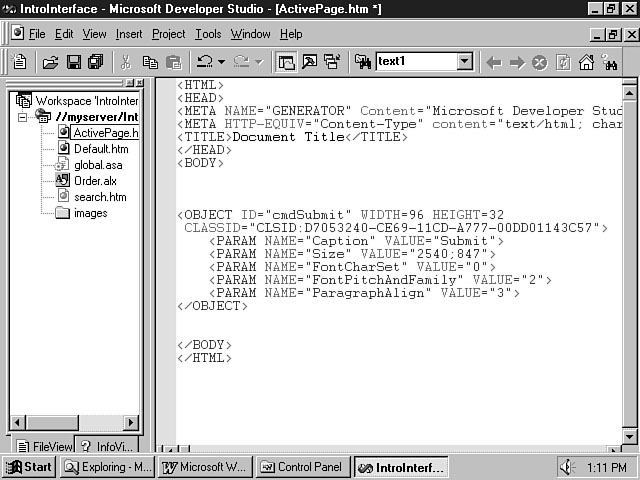
<OBJECT id="cmdSubmit" WIDTH=96 HEIGHT=32
CLASSid="CLSID:D7053240-CE69-11CD-A777-00DD01143C57">
<PARAM NAME="Size" VALUE="2540;846">
<PARAM NAME="FontCharSet" VALUE="0">
<PARAM NAME="FontPitchAndFamily" VALUE="2">
<PARAM NAME="ParagraphAlign" VALUE="3">
</OBJECT>
This example demonstrates an object declaration for a command button, or push
button. You can see that the ID attribute is set to cmdSubmit.
The cmd prefix adheres to the naming standard for command buttons. The WIDTH
and HEIGHT also are specified for the control. The second line of the declaration
depicts the CLASSID for the command button. I think you will agree that
cmdSubmit is a lot more intuitive than CLSID:D7053240-CE69-11CD-A777-00DD01143C57.
In this example, four parameters also are depicted for the command button. ActiveX
controls can consist of a variety of parameters. You can assign values to these parameters,
which supply attributes and characteristics that help define the appearance and behavior
of a control.
Visualizing ActiveX Controls
So far, you have learned about the tags and attributes that enable you to define
Java applets and ActiveX controls. The previous example demonstrated how to use the
<OBJECT> tag to define an ActiveX control. You might be thinking,
"Visual InterDev should provide an easier way to define a control rather than
using tags and attributes. After all, the name of the tool is VISUAL InterDev."
Don't worry, Visual InterDev lives up to its name regarding the integration of controls
into your web pages. Visual InterDev provides two robust editors to accomplish this
task. These editors provide very visual and intuitive methods for placing controls
on your web page.
The following sections introduce and explain the HTML Layout Editor. Visual InterDev
includes this tool to provide a better and easier way to integrate your controls
into your web page. This editor removes you from the process of having to remember
tags and attributes to define a control. The knowledge that you have gained concerning
object tags and attributes is still very valuable. It is always better to know what
is taking place behind the scenes. You also will be able to use your knowledge of
tags and attributes to interpret the HTML file once you have used one of the visual
editors to insert ActiveX controls into your web page.
The other editor is the Object Editor. You can use this editor to insert ActiveX
controls directly into your web page. The Object Editor should be used for placing
no more than a few controls on a web page. There are some limitations that will be
explored concerning the use of this editor when designing an elaborate interface
that uses many controls.
Both of these Visual InterDev editors provide an intuitive way to work with objects.
Both editors support the use of client-side script to access and extend the power
of ActiveX controls. The following sections teach you how to use the features of
both the HTML Layout Editor and the Object Editor.
The HTML Layout Editor
You were introduced to the HTML Layout Editor during the first week, and you used
it to create a layout consisting of ActiveX controls during the lesson on Chapter 4.
YesterChapter, you learned that a form provides a house for your HTML controls. The lesson
made the point that HTML controls derive their meaning and usefulness in the context
of a form. In a similar manner, you can use an HTML layout to integrate multiple
ActiveX controls into your web page. The layout provides purpose and order to the
controls. The HTML Layout Editor also makes it easier for you to develop and work
with the various controls on your web page. This section explains the basic features
of the HTML Layout Editor.
NOTE: As you learn how to use ActiveX
controls and the Layout Editor, reflect on yesterChapter's lesson and how HTML forms
and controls compare to ActiveX controls. You also should consider the development
process for each.
Exploring the Process
If you have used the Microsoft ActiveX Control Pad, you are already familiar with
this editor. The HTML Layout Editor provides a tool to build form layouts that contain
ActiveX controls. The editor is similar to other visual tools that you may have used
in the past to build a graphical user interface. The method for building your interface
uses the same process as tools such as Visual Basic. You select the controls that
you want to use from a toolbox and place them onto a form. Once you accurately position
these objects onto your form, you set their properties to define their behavior and
characteristics. You can then use methods specific to a control to perform certain
tasks. Every ActiveX control contains unique properties and methods. You can use
the HTML Layout Editor to define the value of the control's properties. The methods
for a control enable you to affect the behavior of a control.
New Term: Properties define the appearance
and behavior of a control. Every control has a unique set of properties that pertains
to the control.
New Term: Methods enable you to perform
a specific function on the object. Every object has a defined set of methods that
relate to the control. A method is a pre-defined procedure for the object that you
can use in your code.
An ActiveX control also contains certain events that are specific to the control.
You can associate script code with the events for the controls in your interface.
When an event occurs for the control, the script executes.
Using the HTML Layout Editor
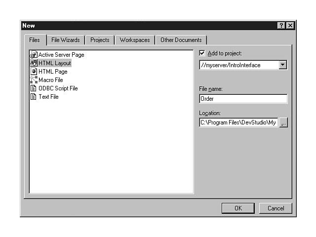
This section explores how to use the HTML Layout Editor to create a user interface
for your web page. To create an HTML layout, select the File menu and choose New
from the list of menu items. Select HTML Layout from the list of items in the File
tab of the New dialog window. You also will need to enter a name for your HTML layout,
as shown in Figure 13.2.
Figure 13.2.
Creating an HTML layout.
You can see that the Add to project checkbox is selected, and the project name
defaults to the currently opened project. The location defaults to the directory
for the default project.
NOTE: You can deselect the Add to project
checkbox to create an independent HTML layout. You also can change the project name
and directory for the HTML layout.
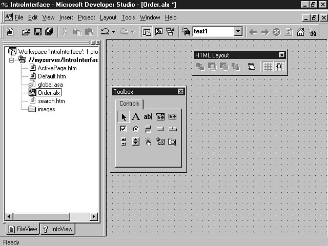
When you click the OK push button, an HTML layout file is created, and the HTML
Layout Editor is activated and displayed as illustrated in Figure 13.3.
Figure 13.3.
The HTML Layout Editor.
As you can see from the example, the HTML Layout Editor provides a form to place
your controls as well as a toolbox that contains basic ActiveX controls. You also
can see the HTML Layout toolbar. This floating toolbar can be docked on the main
Visual InterDev toolbar. You will notice that a file called Order.alx has been created
in the project workspace. The .alx extension identifies the file as an HTML layout.
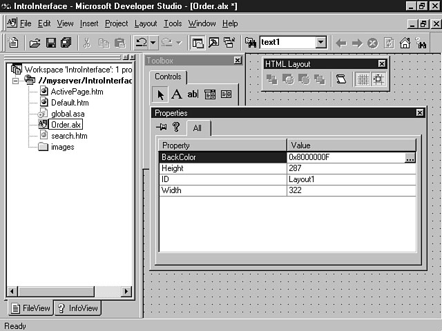
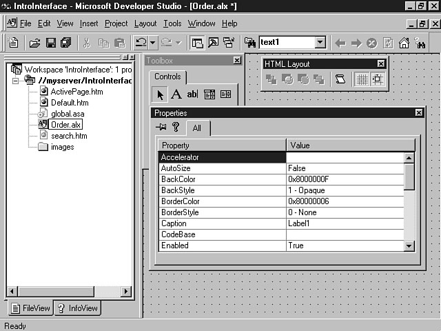
You can adjust the properties for the HTML layout by clicking the right mouse
button anywhere on the layout to display the shortcut menu. Choose the Properties
menu item to adjust the ID, height, width, and background color of the layout. Figure
13.4 shows the properties window for a sample HTML layout.
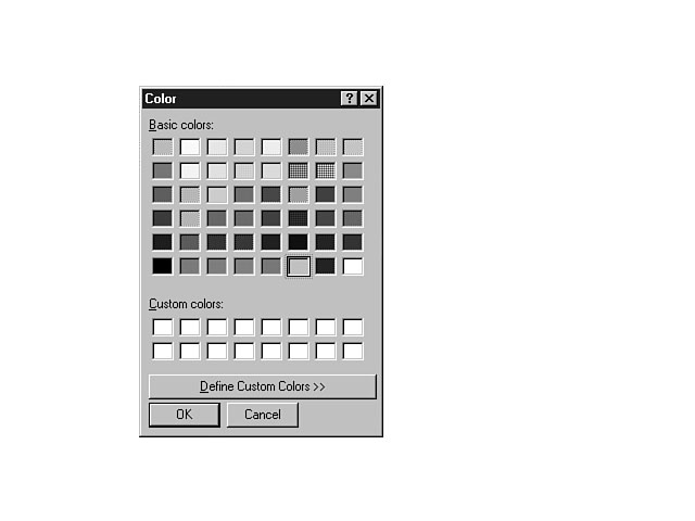
Notice that the BackColor property contains a cryptic code for its value
as well as three small dots to the right of this code. The code defines the background
color for the layout. The three dots save you from having to memorize all the codes
for the possible colors. When you click the dots, the Color dialog window displays,
as shown in Figure 13.5.
As you can see, you are presented with a color palette from which you can choose
a defined color for the layout. You also can create a custom color for the layout
background. The ID defines a name for the layout that you can use to reference the
layout within your code.
Figure 13.4.
Setting the properties for an HTML layout.
Figure 13.5.
The Color dialog window.
Adding ActiveX Controls to Your
Layout
Once you have created an HTML layout, you can add ActiveX controls to build the
interface. Click a control in the toolbox and move your mouse to the desired position
for the control on the form. Click the left mouse button on the form to create a
control with a default size. You also can hold down the left mouse button and drag
the mouse to define a custom size for the control. You were first introduced to this
process on Chapter 4.
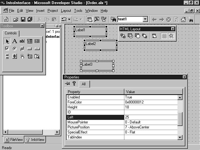
Once you have placed the control on the form, you can customize the properties
for the control. For example, you could place a label onto a form and edit its properties,
as shown in Figure 13.6.
Figure 13.6.
Setting the properties for a label.
As you can see, there are a lot more properties for a label than for a layout.
You can set the height, width, top and left alignment, caption, font size, and so
on. You also will want to define a descriptive name to reference the control. The
ID property is used for defining this attribute. The naming convention for
a label control contains the lbl prefix. For example, the ID for
a label for the name text box should be called lblName.
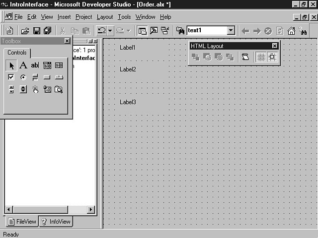
You can easily move the controls on the layout to ensure their proper placement.
You also can graphically drag the corners of a control to alter its size. If you
need to move multiple controls, you can click the first control and then hold down
the Shift key and click the other controls. This method enables you to select multiple
controls at a time and move the controls as a group. You also can select multiple
controls at a time and set the correlating properties for the controls. For instance,
you could select three labels that were placed vertically on a form and set the Left
property for the controls to be the same. To do this, you use the method presented
previously to select the three controls. With the three controls selected, click
the right mouse button and choose Properties from the shortcut menu. A Properties
window is displayed for the controls. You can then set the value of the Left
property for the controls. Figure 13.7 depicts this dialog window.
Figure 13.7.
Setting the properties for multiple controls.
Notice that the value that you enter applies to all three controls. The label
controls are then displayed and aligned, as seen in Figure 13.8.
Figure 13.8.
Aligning the labels on a form.
Customizing the Toolbox
You were introduced to the HTML Layout Editor toolbox in Figure 13.3. This example
displayed the default controls for the toolbox. You can add more controls to the
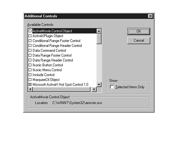
toolbox by clicking the right mouse button on the toolbox. Choose Additional Controls
from the shortcut menu to display a list of additional controls, as illustrated in
Figure 13.9.
Figure 13.9.
Adding controls to your toolbox.
The Additional Controls dialog window displays all the ActiveX controls that have
been registered on your client machine. You can choose the controls you want to add
to the toolbox by clicking the checkbox to the right of the desired controls and
clicking OK.
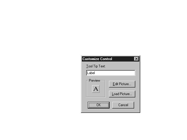
You can delete controls from the toolbox as well as customize the configuration
of current controls on the toolbox. To delete a control from the toolbox, right-click
the mouse on the control and choose the Delete option from the list of menu items.
To alter the display of a control on the toolbox, right-click the mouse on the control
and select the Customize menu item. Figure 13.10 demonstrates how you can alter the
way a control is displayed on the toolbox.
Figure 13.10.
The Customize Control dialog window.
You can alter the Tool Tip text for the control and the picture that is displayed
in the toolbox. You can edit the current image as well as load a new image for the
control.
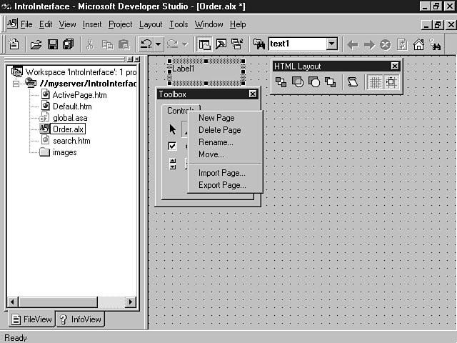
You also can create new tabs, or pages, for the toolbox. Click the right mouse
button on the Controls tab to display the toolbox shortcut menu. Figure 13.11 displays
the list of options for the toolbox
Figure 13.11.
Managing the tabs in the toolbox.
Each of these options has a different function. You can use these options to further
organize your ActiveX controls. Table 13.2 defines each of the menu items for managing
the tabs in your toolbox.
Table 13.2. Shortcut menu options for the HTML toolbox.
| Menu Item |
Function |
| New Page |
Creates a new tab for the toolbox |
| Delete Page |
Deletes the current tab in the toolbox |
| Rename |
Enables you to rename the current tab |
| Move |
Moves the order of the tabs |
| Import Page |
Imports a pre-defined tab page from a file |
| Export Page |
Saves a tab page to a file |
Once you create the HTML layout, you can save the layout by selecting Save from
the File menu. After you have saved the layout, you are ready to insert it into your
HTML page.
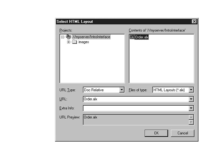
Inserting a Layout into a Web Page
You must insert the HTML layout file into the web page to use the layout in your
application. The HTML web page document uses the ALX file to refer to the layout.
The ALX file contains all the information concerning the placement and characteristics
of the controls as well as any script that has been included for the layout. To insert
a layout into a web page, right-click the mouse button at the location in your web
page document where you want the layout and choose Insert HTML Layout from the shortcut
menu. A dialog window that enables you to choose the HTML layout to insert is then
displayed. Figure 13.12 demonstrates an example of the Select HTML Layout dialog
window.
Figure 13.12.
Selecting an HTML layout.
You can choose an HTML layout from the list in the dialog window and click OK
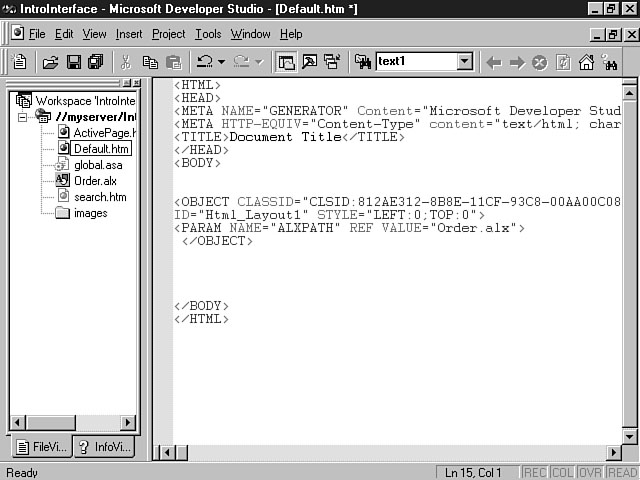
to insert the HTML layout. Figure 13.13 depicts an example of an HTML layout as it
is displayed in a web page.
To edit this layout, right-click the mouse in between the object tags for the
layout and choose Edit HTML Layout from the list of menu items. The HTML Layout Editor
becomes activated and opens the layout. You can then visually manipulate the properties
and characteristics of your layout. Save your changes to the layout. The updates
are communicated to the web page that contains the HTML layout.
Figure 13.13.
A non-visual view of the HTML layout.
The Object Editor
The Object Editor provides the other visual editor for inserting ActiveX controls
into your web page. The Object Editor is best used for individual controls that you
want to include on your web page. Whereas the HTML Layout Editor enables you to manage
multiple controls on a form, the object editor is used for managing one control at
a time. You cannot place controls on top of controls with the Object Editor as you
can with the HTML Layout Editor. For example, you might need to place a set of radio
buttons on a frame for a form. Because the radio buttons are placed on top of the
form, or layered, you must use the HTML Layout Editor to achieve this. The Object
Editor doesn't support this kind of interface.
The Object Editor does, however, provide a robust visual editor for manipulating
the properties of individual controls on a web page. The following sections outline
how to insert an ActiveX control into a web page and use the Object Editor to set
its properties.
Inserting an ActiveX Control into
a Web Page
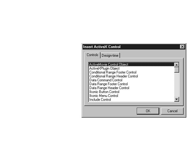
You can insert an ActiveX control into a web page by right-clicking the mouse
at the location in the web page where you want to place the ActiveX control. Select
Insert ActiveX Control from the shortcut menu. A dialog window will be displayed,
enabling you to insert ActiveX and Design-time ActiveX controls. This window is displayed
in Figure 13.14.
Figure 13.14.
Inserting an ActiveX control.
You then can choose a control from the Controls tab. You also can click the Design-time
tab to insert a Design-time control. These controls are covered during Chapter 14, "Extending
Web Pages Through Design-Time Controls." The controls that are listed in this
dialog window are ones that have been registered for use on your client machine.
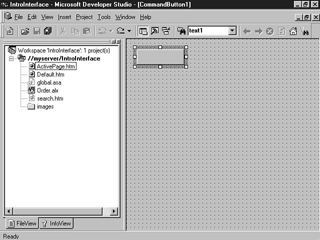
Once you choose a control and click OK, the Object Editor is displayed along with
the control that you have selected. Figure 13.15 displays a command button as it
appears in the Object Editor.
Figure 13.15.
The Object Editor.
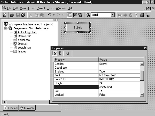
You can set the properties for this control by right-clicking the control and
choosing Properties from the shortcut menu. Figure 13.16 depicts the Properties window
for the command button.
Figure 13.16.
Setting the properties for the command button.
Once you have defined the properties for the control and saved the object, the
ActiveX control is inserted into your web page. Figure 13.17 depicts the presence
of the command button in a sample web page.
Figure 13.17.
An ActiveX control as it appears in a web page document.
Editing an ActiveX Control
To edit the ActiveX control, open the web page document and right-click the mouse
within the object tags for the control that you want to edit. Select Edit ActiveX
Control from the shortcut menu to display the Object Editor for the control. You
can then change the properties for the control as described in the preceding section
and save the updates. The changes that you make will be reflected in the web page.
ActiveX Controls at a Glance
Visual InterDev supports the use of ActiveX controls in your web pages. Many powerful
and exciting ActiveX controls are included with Visual InterDev. The previous sections
provided an overview of the visual editors that you can use to work with these controls.
This final section for the Chapter briefly introduces you to some of the ActiveX controls
that are available within the Visual InterDev environment.
A Preview of ActiveX Controls
Visual InterDev includes several controls for you to use when designing the interface
for your application. These controls provide basic functionality similar to the forms
controls that you discovered yesterChapter. ActiveX controls, however, offer more properties
that you can set to customize the characteristics and behavior of the control. You
also can use a robust set of methods and events for the controls to enliven your
application. Table 13.3 outlines some of the basic controls that are available with
Visual InterDev.
Table 13.3. Microsoft forms controls.
| Control |
Description |
| Check Box |
Enables user to select one or more choices |
| Combo Box |
Enables user to enter text or select item from a list |
| Command Button |
Push button that user can press to initiate an event |
| Label |
Text typically used to describe other controls |
| List Box |
Enables user to choose one or more items from a list |
| Radio Button |
Enables user to select one choice from a group of items |
| Scroll Bar |
Enables the user to set the value of another control by scrolling in some direction |
| Spin Button |
Enables user to change a number by clicking one of the arrows |
| Tab Strip |
Presents a tabbed dialog window to the user that groups related controls |
| Text Box |
Enables the user to enter a single line of text |
| Toggle Button |
Displays whether a control is selected |
There also are some very specific ActiveX controls that have been developed especially
for the Internet. These controls are relatively new and enable you to build an interface
for your application that is truly tailored to the Web. Table 13.4 depicts some ActiveX
controls that are specifically geared to the Web.
Table 13.4. Web-based controls.
| Control |
Description |
| Hot Spot |
Represents an area on a page that can trigger an event |
| Image |
Displays an image to the user |
| Marquee |
Enables you to place scrolling text onto a web page |
| New Item |
Enables you to denote new items on a page |
| Preloader |
Enables you to load a control's URL into the client computer's cache and download
the control when necessary |
| Stock Ticker |
Provides a stock ticker for the web page that downloads dynamic data |
ActiveX controls are displayed in the Visual InterDev environment if they have
been downloaded and registered for use on your machine. You will get a chance to
use these controls during the first part of next week.
Summary
ToChapter's lesson extends the knowledge that you gained yesterChapter concerning form
controls to the wonderful world of ActiveX controls and Java applets. These advanced
objects can be used to truly enrich the look and feel of your Web-based application.
This lesson has served as a primer for the lesson on Chapter 15, when you will be able
to apply this knowledge to building an interface for your application.
The first part of toChapter's lesson presented an overview of objects. The lesson
provided a definition of an object to set the context for the Chapter. Then, you were
introduced to Java applets. During this part of the lesson, you gained an understanding
of the <APPLET> tag. The lesson taught you how to use this tag to
insert a Java applet into your web page. You also discovered some of the attributes
and parameters associated with the <APPLET> tag to define its basic
characteristics. The lesson then moved on to a discussion of ActiveX controls. You
received a basic overview of ActiveX controls. You also learned about the typical
attributes for an ActiveX control.
The latter part of the Chapter focused on the visual editors for ActiveX controls
included with Visual InterDev. The HTML Layout Editor enables you to relate, organize,
and work with multiple ActiveX controls. You can create a robust form interface for
your application through the use of this editor. The Object Editor is another visual
editor that enables you to insert individual ActiveX controls into a web page. The
final part of the lesson presented an introduction to some of the more common ActiveX
controls.
Q&A
- Q How can I use ActiveX controls?
AActiveX controls provide a robust solution for creating an interface for your
application. You can use some of the more basic controls like text boxes, radio buttons,
list boxes, and push buttons to create intuitive forms for your users. You also can
use some of the newer controls that have been built specifically for the Web to create
dynamic web pages.
Q Is ActiveX Microsoft's answer to Java
AIt is a common mistake to compare ActiveX and Java. They are complementary,
not competing, standards. Java is a programming language that supports multi-platform
development. ActiveX differs in that it provides objects written in a variety of
languages that you can use to integrate into your application. ActiveX controls can
be used with Java applets to provide rich functionality for your application.
Workshop
For toChapter's workshop, you need to visit two web sites on the Internet. These sites
provide pertinent information on the use of Java applets and ActiveX controls. The
first site is www.gamelan.com. This site provides one of the best web sites
for discovering more information on Java programming and Java applets. The second
web site is www.microsoft.com/activex/controls/. This site provides extensive
information on ActiveX controls, including a gallery of many ActiveX controls from
third-party providers.
Quiz
- 1. What is the tag that can be used to insert Java applets as well as
ActiveX controls into a web page?
2 Name the two visual editors for objects provided by Visual InterDev.
3.What is a property?
Quiz Answers
- 1. The <OBJECT> tag.
2. The HTML Layout Editor and the Object Editor.
3. A property defines the characteristics and behavior of a control. Every control
has a unique set of properties that can be customized.
|


 MS Access
1109
MS Access
1109
 C++
1222
C++
1222
 HTML
584
HTML
584
 JavaScript
616
JavaScript
616
 Vbscript
873
Vbscript
873
 Oracle
473
Oracle
473
 VC++
875
VC++
875
 SQL
2959
SQL
2959
 XML
514
XML
514
 Java
814
Java
814
 Perl
455
Perl
455
 Linux
451
Linux
451


