Web based School
|
This lesson is the first in a series about constructing a user interface for your
application. You were introduced to design considerations and HTML and browser extensions
on Chapter 3, "Design and Development Considerations." ToChapter's lesson focuses
on intrinsic objects and controls available with HTML 3.x. These HTML objects and
controls enable you to build an interface for your application that lets the user
interact with the information in your web site and make use of your application's
features. The objects and controls described in this lesson are intrinsic to HTML--that
is, an inherent part of the language. You can use these controls right out of the
HTML box. New Term: Intrinsic defines a control
as part of a native language. In the context of the Web and this lesson, the term
intrinsic defines those objects and controls that are part of HTML. In other words,
these controls are internal to, or included with, HTML. You will learn about other objects and controls over the next few Chapters that are
extrinsic, or external, to HTML. In tomorrow's lesson, Chapter 13, "Interacting
with Objects and ActiveX Controls," you will explore the ActiveX controls included
with Visual InterDev. You will also get an overview of how to use these objects and
Java applets to extend your application's user interface. On Chapter 14, "Extending
Web Pages Through Design-Time Controls," you will learn about using Design-time
ActiveX controls in your Visual InterDev application. Finally, on Chapter 15, "Integrating
Objects into Your Applications," you will learn how to integrate extrinsic objects
and controls into your application and extend the objects' functionality with scripting
code. New Term: Extrinsic defines a control
as external to the native language. In the context of the Web and this lesson, the
term extrinsic defines those objects and controls that are external to HTML. In other
words, these controls are separate from HTML. Extrinsic controls are developed by
third-party software providers and can be integrated into a web page by inserting
the object or control into the HTML document. ToChapter's lesson covers these topics: First, it examines HTML forms and their controls.
The majority of toChapter's lesson is spent covering the basic and advanced elements
of HTML forms. You learn about HTML controls that you can integrate into your application
interface, including the text control, the textarea control, the button control,
the radio button and checkbox controls, and the password control. You get instructions
on how to use these controls to design the perfect interface. The lesson also introduces
you to some of the more advanced HTML controls that are available. Next, you learn how to use these controls to develop an HTML form. The lesson
also reviews some basic concepts of HTML form design and effective design tips for
your forms. At the end of the Chapter, the lesson combines all the concepts and methods
you've learned to create a form-based application.
A form provides the house for a control. Just as a house consists of rooms, an
HTML form consists of HTML controls. Rooms can't be useful unless they're constructed
within the house. You don't, for example, build a kitchen as a separate structure
(not these Chapters, anyway); a kitchen becomes useful when it combines with other rooms
to form a house. Similarly, a control or group of controls get their meaning, or
purpose, within the context of a form. The form gives function to the control.
The basic function of a form is to provide an interface for the user to perform
a task or set of tasks. The American Heritage Dictionary defines interface as "the
point of interaction or communication between a computer and another entity, such
as a person." The form enables a person to interact with the computer and, more important, your
application. You can create forms to supply many functions for your applications,
including the following:
HTML forms are easy to construct in a short time by using simple HTML tags and
attributes. Developing HTML forms is iterative and quick, and you can preview their
layout in the Visual InterDev environment to assess the strength and effectiveness
of their design. As with other graphical tools, such as Visual Basic, you must be careful how you
use them. You don't want to throw your interface together without any thought just
because the process and tools are quick and easy. Also, you don't need to use each
and every control on a form just because you have so many to choose from. Form design
considerations are discussed in more detail in the section entitled "Reviewing
HTML Form Design."
A form is placed in a web page document by using the start tag <FORM>
and end tag </FORM>. All the form tags, attributes, and controls must
be placed inside the start and end tags. The start tag consists of two associated
attributes: METHOD and ACTION. These attributes help define the
form's behavior. The METHOD attribute specifies the data format of the information submitted
from the form to the server program. It has two valid values: GET and POST.
The default value, GET, is used for a few simple values to be sent to the
server. These values are added to the end of the URL that's passed to the server.
The GET value limits the amount of information that can be passed to the
server. You can also use the POST value to pass information for multiple
form elements to the server; use this if your form has more than a couple of fields. The ACTION attribute indicates the location and name of the server script
that processes the form. You can specify the script's URL or use a relative path
to set the value of the ACTION attribute. Many of the examples in yesterChapter's
lesson on Active Server Pages used forms as the main user interface. The value of
the ACTION attribute in those examples referred to an ASP that contained
the server script. You can use any type of scripting code to process a form's request,
including CGI, ASP, and native APIs, such as ISAPI or NSAPI. The following code line
demonstrates how to use the attributes of the <FORM> tag: This code example uses the POST method to send the data to a server script
program called Submit.asp that's located in the relative path of /MyProject/Scripts.
By using the POST method, the server script has access to all the data elements
contained on the form. Now that you understand the purpose of the form, you can go on to learn about
the HTML controls that make the form come alive.
If you have developed an application that used a graphical user interface, you're
probably already familiar with controls, which give you the basic tools for constructing
your application's user interface. Controls serve as the intermediary between users
and applications. You can use controls to enable the user to enter information, designate
preferences, and select items from a list. In other words, the controls on your form
make it possible for users to interact with your application to perform certain tasks. HTML forms support the use of certain intrinsic controls that offer specific functions
based on their design. The following sections describe the form controls offered
by HTML.
You create controls by using certain sub-element tags within a form's start and
end tags. Table 12.1 lists the types of form sub-element tags and their functions.
These sub-element tags help you specify the type of control you want to construct.
For a selection list, you can use the <SELECT> tag to create the options
to populate the list. These tags must be placed inside the starting <FORM>
and ending </FORM> tags. The next sections explain the syntax for
using these tags.
The <INPUT> tag is the most common type of sub-element tag, probably
because it can be used to create several of the most common controls you define for
a form. The controls created by the <INPUT> tag give you a way to
collect information from the user. They include text controls, radio buttons, checkboxes,
images, and push buttons. The syntax for using the <INPUT> tag is
as follows: Type is the type of control you want to create, Name defines
the name of the control, and Value represents the initial value displayed
for the control. The nChars value, when related to the SIZE attribute,
defines the text control's width in number of characters; when it's related to the
MAXLENGTH attribute, it defines the maximum number of characters that can
be entered in a text control. Use the CHECKED attribute to allow a checkbox
or radio button to appear selected.
You can use the <SELECT> tag to create a selection list control,
which enables the user to choose an item from a list of options. You have probably
used this type of control with other development tools and referred to it as a drop-down
listbox or a scrollable listbox. The <SELECT> tag is used with the <OPTION> tag,
which is used to specify the list of available options. This is the basic syntax
for the <SELECT> tag: In this code example, Name is the name of the selection list control,
Number specifies the number of items in the list that are visible to the
user, Value is the value to be sent to the server when the value
option is selected, and NameofValue is the formatted name of the option
that's displayed to the user. You can use the MULTIPLE attribute to enable
the user to select multiple items from the list. A typical selection list has many items, so you usually construct a selection
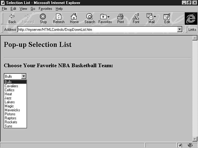
list with the following syntax: Listing 12.1 demonstrates how to use the selection list control.
This code example, which displays a list of basketball teams, constructs a scrollable
selection list that displays seven items at a time, as shown in Figure 12.1. Viewing items in the list. In addition to creating a scrollable listbox, you can also create a drop-down
listbox by manipulating the SIZE attribute of the <SELECT>
tag. A drop-down listbox displays only one item at a time, but the user can see the
rest of the items by clicking the down-arrow key. The drop-down listbox is also referred
to as a pop-up selection list. Listing 12.2 shows how to make a simple change to
the previous code example to create a drop-down listbox.
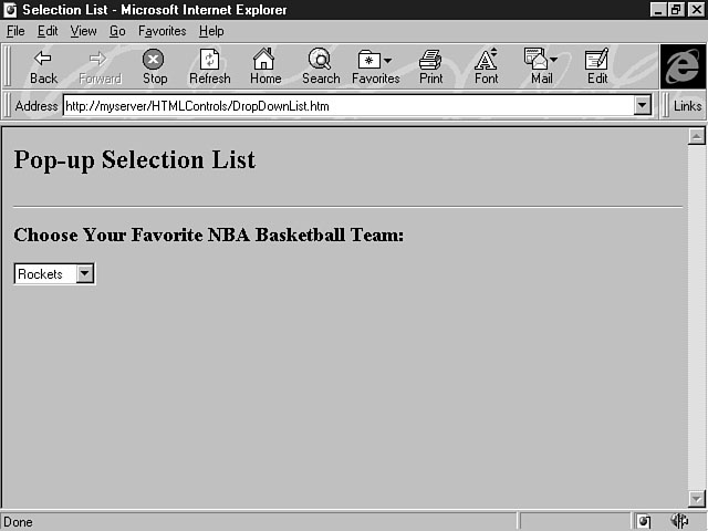
In this code example, the SIZE attribute is changed to the value of 1,
which means one item at a time is displayed, as shown in Figure 12.2. To display the items in the drop-down listbox, the user can click the down-arrow
to make the items pop up, as shown in Figure 12.3. The SELECTED attribute can be used with the <OPTION> tag
to define an initial, or default, selection in the list. If you specify this attribute
for an item in the list, that item is selected when the form opens. For example,
you could choose the Rockets as the default selection for your favorite team when
the form first opens, as shown in Figure 12.4. Viewing one item at a time. Seeing the rest of the items in a drop-down list. Choosing a default selection. Listing 12.3 gives you the code for defining a default selection for the list.
In this example, the <OPTION> tag for the Rockets item uses the
SELECTED attribute to specify this item as the default selection in the
list. The next few sections cover the types of form controls you can build by using
HTML and the <INPUT> tag.
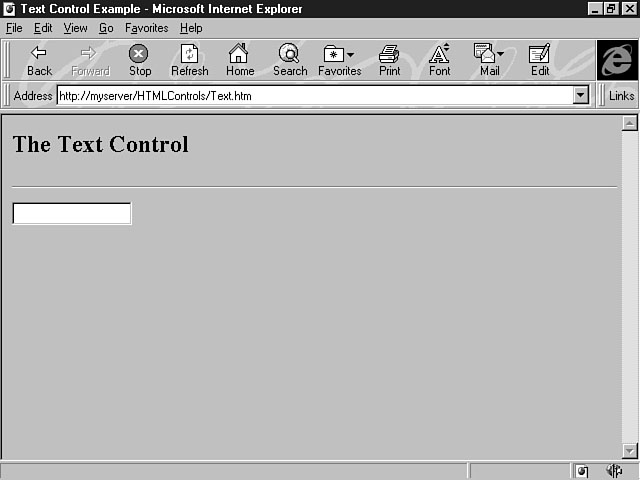
The text control enables you to create a single-line entry field that can handle
alphanumeric data, including numbers and strings. You can create a text control by
using the <INPUT> tag; its syntax was explained earlier in toChapter's
lesson. Here's an example of using the <INPUT> tag to develop a text
control: The TYPE attribute is set to "TEXT", which is also
the default value for the <INPUT> tag. If you don't define a value
for the TYPE attribute, a text control is created; however, you should always
assign an explicit value for your attributes so that your code is easily understood
by other developers. The NAME attribute contains the value of "txtName"
in this example. Text controls should have the prefix txt. The SIZE attribute
of 20 defines the text control as approximately 20 characters long. If you
don't specify a value for the SIZE attribute, a text control is created
with the default size. Figure 12.5 shows the text control created from this line
of code.
Creating a text control. The VALUE attribute, defined earlier, can also be used with the text
control. This attribute enables you to indicate an initial value that's displayed
in the text field. Another attribute that can be used with the text control is the
MAXLENGTH attribute, which is used to specify the maximum number of characters
that can be entered in the text field.
The button control is used to create a push button for the form. Push buttons
were first introduced during the lesson on Chapter 7, "Extending Your Web Page Through
Client-Side Script." Most of the scripting examples covered during that lesson
used a push button to carry out an action, which is exactly what a button control
is for; it enables the user to perform or complete a task. The button's caption should
describe the action to be performed. For example, a Submit button tells the user
it's the button to click to submit the form to the server. The following example demonstrates the syntax for defining a button control for
your form: This line of code creates a push button named Submit. The TYPE attribute
is assigned the value of "SUBMIT", which means a button control
will be placed on the form. This type of button control submits the form for processing
by the script specified in the form's ACTION attribute. Another value of
the TYPE attribute is RESET, which creates a button to clear the
contents of the form elements and reset any default values for the controls. The
VALUE attribute is used to define the caption on the push button. Also,
notice that the NAME attribute has the value of "cmdSubmit".
The naming standard for the button control uses the cmd prefix. The caption for the
push button should accurately describe its function; however, don't use too many
words for the text. For example, if a button saves information to a database, use
the caption of Save rather than Save the Record to the Database.
For HTML button controls, the button's size is determined by the caption you specify
for the control. The browser uses the length of the caption and font size to determine
the button's appropriate size.
You can use the button control to send and retrieve information to the server.
The push button is typically used with other controls on a form to enable the user
to perform some action. In the previous section, you learned about setting the TYPE
attribute to a value of SUBMIT, which constructs a push button that sends
data on the form to the server. This form is processed by the script you specify
in the ACTION attribute of the <FORM> tag. Listing 12.4 demonstrates
how to use this attribute, along with the other controls you've learned about so
far, to create a form that submits information to be processed by the server.
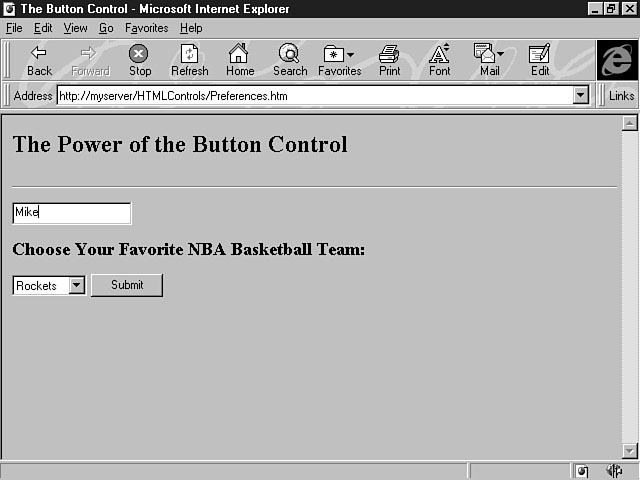
This code example combines the text control, the selection list, and the button
control to create a useful form. Users can enter their name, select their favorite
NBA team, and then submit this information to the server by clicking the Submit button.
The user information is processed by an Active Server Page called Submit.asp. This
script formats a page with the user's name and his or her favorite NBA team. Figure
12.6 shows the form that the user sees. Selecting your favorite team. Figure 12.7 demonstrates the results returned to the user based on the information
that was entered. Displaying the results.
The location of the button control is determined by where you place its definition
in the HTML document. In the previous example, the Submit button is placed next to
the selection list control. You could have moved the push button to a new line in
the web page by using a <P> or <BR> tag to specify
a new paragraph or a line break. You can also use the alignment tags to change the
placement of the button control. For example, the following line of code places a
push button in the center of a web page: Option buttons enable a user to choose from a small list of options. There are
two kinds of option buttons: radio buttons and checkboxes. HTML supplies both of
these controls to display on your forms.
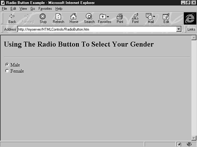
The radio button control is used for mutually exclusive options. In other words,
the user can choose only one of the options. Choosing from a list of credit cards
to confirm a payment method is a good example of using mutually exclusive choices.
Radio buttons should be used only when the number of choices is six or less. This is the syntax for creating a radio button control: Name is the name of the radio button, and Value is an optional
parameter that indicates the value for the option passed to the server. For example,
the following lines of code create two radio buttons to enable users to specify their
gender: Figure 12.8 illustrates how these options are displayed on the form. Specifying your gender. When the user specifies a gender, a dark circle covering most of the center of
the radio button indicates that the item has been selected. The previous code example uses the prefix naming standard of opt for radio buttons.
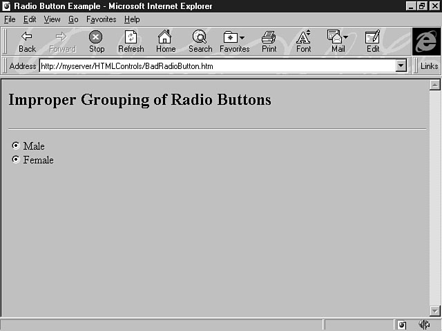
Notice, too, that the names are identical for both options. You must use the same
name for radio buttons that are grouped together. If you didn't assign the same names
for these controls, the form would treat the options as independent controls, and
the user could then select both options, as shown in Figure 12.9. A lack of proper grouping. You can also use the CHECKED attribute to select a default option for
the user. The following lines of code make Female the default selection: Notice that the CHECKED attribute is placed as the last parameter in
the <INPUT> tag.
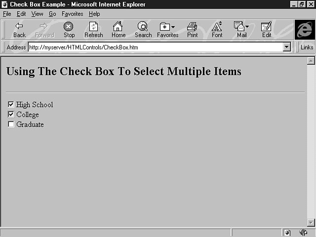
The checkbox control enables the user to select more than one option from available
choices. Indicating your completed levels of education is a good example of using
checkboxes. As with radio buttons, you should use checkboxes only when the number
of choices is six or less. This is the syntax for creating the checkbox control: Name is the name of the checkbox, and Value is an optional parameter
that indicates the value for the option passed to the server. The following lines
of code create checkbox options for users to indicate their completed levels of education: Notice that the naming standard for checkboxes uses the chk prefix. Also, the
options in a checkbox have different names. As opposed to selecting only one item
with radio buttons, users can select several items with checkboxes. For this reason,
you must supply different names for the individual options. Figure 12.10 shows the
results of this code example. Selecting multiple items. The user can select all the education levels that apply from the list of choices.
Notice that a check mark indicates selected items. As with the radio button control, you can use the CHECKED attribute to
specify an option as the default selection. The code to carry out this task is similar
to that for the radio button control: In this example, High School is the default selection.
The radio button control and the checkbox control differ slightly in their behavior
because they have different purposes. The process of actually selecting a radio button
or a checkbox is the same--the user simply clicks the item he or she wants. The difference is in how items are deselected. For radio buttons, the currently
selected item is deselected when the user chooses another radio button in the list.
That new item, then, is selected. For the checkbox control, the user can select multiple
items. To deselect an item, the user must click a currently selected item. The check
mark disappears, indicating that the item is no longer selected.
The password control is a special version of the text control. Essentially, the
two controls are the same, but the password control displays asterisks, not text,
as the user enters his or her text. You can use the password control for "sensitive"
information, such as a user's password; that's why it's called the password control.
The asterisks mask the characters from displaying in the field. The syntax for this control is almost identical to the text control, except that
the value of the TYPE attribute changes, as shown in this example: What you specify for the TYPE attribute is the biggest difference between
defining a password control and a text control. In this example, the TYPE
attribute has been assigned the value of "PASSWORD", which means
the control is a password control. The naming standard for the password control is
the same as the text control's; both use txt as the prefix. The SIZE attribute of 10 defines the password control as approximately
10 characters long. If you don't specify a value for the SIZE attribute,
then the password control is created with the default size. The VALUE attribute can be used to indicate a default selection that's
displayed in the pass-word text field when you open the form. Another attribute that
can be used with the password control is MAXLENGTH, which enables you to
specify the maximum number of characters that can be entered in the password text
field. Listing 12.5 shows how to use the password control in an application.
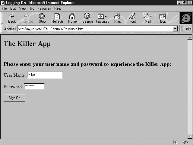
This code example gives the user a way to log onto your killer application. A
text box control is used for the user name, and a password control is used for entering
his or her password. This information is then passed to an Active Server Page that
verifies the user name and password. Figure 12.11 shows the form that's displayed
as a result of this code example. Logging onto the killer application.
The textarea control enables you to construct a multiline text box that lets the
user enter multiple lines of text. This is the basic syntax for the textarea control: Name is the name of the control, nRows defines the number of
rows, or height, for the textarea control, and nCols specifies the number
of columns, or width, for the control. The number of rows defining the control's
height equates to a specified number of lines; the number of columns defining the
control's width is measured in number of characters. The browser determines to some degree the behavior of the multiline text box.
Some browsers automatically word wrap the text to the next line. With others, you
can enter text past the control's display area and use a scroll bar to view the text. The following line of code shows how to use the textarea control: This line of code creates a multline text box that enables the user to enter an
address, which is a common use for this control. It's often used for entering e-mail
messages and memos, too. Notice that the naming standard of the textarea control
uses the prefix txa. The control in this example is 5 lines long and 40 characters
wide. The textarea control doesn't support using the VALUE attribute to assign
a default selection for the control. As an alternative, you can specify text to be
placed in the control by placing it inside the textarea tags. The following line
of code demonstrates this method: This code formats the text Houston, Texas as the control's initial value
when the form opens.
So far, you have learned about a form's characteristics and how to construct one.
You have also learned about the HTML form controls and seen how to use them on a
form. In the following sections, you learn how to develop functional HTML forms that
use client-side script. The lesson gives you some examples of integrating VBScript
with forms and form controls.
You learned about client-side script on Chapter 7. ToChapter's lesson and the lessons
for the next couple of Chapters teach you how to apply the concepts you learned. You can create event procedures for your controls. For a button control, there
are two types of event procedures: implicit procedures and explicit procedures.
The first type of procedure, called an implicit event procedure, is tied to the
control. Here's the syntax for creating an implicit event procedure: ButtonName refers to the name of the button control on the form, and
the event procedure's name must be the same as the name assigned to the button control.
Listing 12.6 shows how to use an implicit procedure and client-side script to process
a button click.
This code example extends the form created in Listing 12.5 that allowed the user
to sign onto your killer application. The <FORM> tag is used to assign
MyForm as the form's name. The form name is used to access the value of
the text control for the user name. Notice that the name of the event procedure is
the same as the name of the button control; that's why the procedure is referred
to as "implicit." The Password variable is created and assigned the value entered by the
user in the form's password control. The VALUE attribute contains the text
entered in this field. For HTML form controls, you must prefix the control's name
with the name of the form and the name of the web page. In this case, Document
refers to the entire web page. The method for referring to a value for a form control
is easy to figure out because the controls are contained on the form that's part
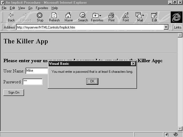
of the document or web page. Next, the Len statement is used to verify that the length of the password
is six characters or more. If not, a message box is displayed informing the user
that the password must be at least six characters, as shown in Figure 12.12. Reminding the user that the password must be at least six characters long.
The second type of event procedure, called an explicit procedure, enables you
to process script code for a button control. The "explicit" in the term
explicit procedure means you can give the procedure a name. Remember that an implicit
procedure must assume the name of the button control. With an explicit procedure,
however, you're free to customize the name of the procedure so you can supply a more
descriptive name. You can also share this procedure across controls on your form
because it isn't implicitly tied to the button control. The following lines of code create an explicit event procedure: In this example, the ONCLICK attribute enables you to specify which procedure
to execute when the push button is clicked. Here, the procedure is named ValidatePassword.
The LANGUAGE attribute is used to indicate the scripting language for the
event procedure; this example uses VBScript. Listing 12.7 shows an example of using
an explicit event procedure to process the user sign-on form.
This example uses an explicit event procedure to validate the length of the password.
Notice that the procedure name is customized to reflect what the procedure does.
Also, the tag to create the button control includes the LANGUAGE and ONCLICK
attributes. The ONCLICK attribute gives control to the ValidatePassword
procedure when the user clicks the Sign On button.
The form's design of the user interface is crucial to your application's success.
Using the house analogy again, if you hired a builder to build a new house, you wouldn't
want him to suddenly grab a hammer and nails one Chapter and decide to build the house.
You hope that the builder spends some time designing the house first, and you want
him to follow blueprint designs and approved standards for constructing the rooms.
You have asked for the rooms to be built in a particular way because you want living
in the house to be a rich, rewarding experience--a place you look forward to returning
to. Form design might not be as important as providing a roof over your head, but
this analogy shows you the importance of form design. You should definitely spend
time contemplating your form's design. Ask yourself: "What is the user trying
to do by using my application? How does this form help her perform certain tasks?
Which controls should I use to make performing those tasks easier?" As a developer,
the task of choosing the right control to perform the task is a vital part of constructing
the user interface. Choosing the right tool is a required skill when you're designing
and developing an application. The next section outlines some design tips for HTML forms.
You should design your form with effectiveness in mind. In other words, you should
design and develop an interface that lets the user be effective in performing the
necessary tasks. Here are some tips to remember for designing an effective form:
During toChapter's lesson, I have given you standard naming conventions for each control.
These standards make it easier to distinguish each control and its type. A summary
of these naming standards is given in Table 12.2.
This section shows you how to build a sample application using the concepts you've
learned about forms and form controls. The application uses forms, form controls,
and some client-side script. The server-side process isn't covered in this lesson,
so refer to yesterChapter's lesson on Active Server Pages for a refresher on server processing.
You get a chance to integrate both the client and server side of an application during
the lesson on Chapter 21, "Putting It All Together: The Publishers' Paradise Case
Study."
This sample application demonstrates how to use each of the controls you've learned
about toChapter to build an effective user interface. The first form enables users to
log onto the application. After they sign on, they can enter their name and address
information and choose their favorite NBA teams to order a game schedule, roster,
and a catalog of team items for the current season.
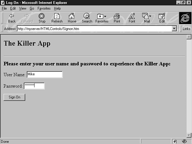
The first form uses a previous code example to create a form that enables the
user to log onto the application. Listing 12.8 contains the code to create this form.
You studied this code example earlier toChapter. As a reminder, the code uses an explicit
event procedure containing client-side script to validate that the password entered
is the appropriate length. This code doesn't verify the user ID against a database,
but you could easily add this feature by using an Active Server Page. Figure 12.13
shows the first form users see when using this application. Logging onto the application.
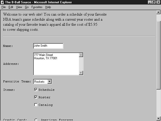
Next, you need to construct the order form used to order the roster, game schedule,
and a catalog of team items, such as jerseys, hats, and so on. Listing 12.9 shows
the code for creating the order form.
This code example creates an order form that uses many of the controls explained
in toChapter's lesson. The <PRE> tag is used to define explicit formatting
for the controls on the form. The form uses the text control for the name and credit
card number fields. Checkboxes are used to enable users to select the items they
want to order. Since all the items can be chosen, the proper control is the checkbox.
Radio buttons are used for the type of credit card to be used for payment. Figure
12.14 demonstrates the results of this code example. The user has entered a name and address, chosen a favorite NBA team, and selected
several items to be ordered. When the user enters the credit card information and
clicks the Submit button, the order information is sent to the ASP to be processed. Ordering information about your favorite team. This example demonstrates how to effectively design and develop a form for your
application. Over the next few Chapters, you will learn to distinguish the differences
between using HTML form controls and using other controls and objects to process
information for your application.
You have learned a lot about forms and controls and their purpose. HTML forms
aren't the most robust, powerful user interfaces, but they do have their purpose.
Over the next few Chapters, you will learn about some more robust tools that can be used
to build the user interface. The concepts you've learned toChapter, however, can be applied
to other types of controls. The forms and controls described toChapter enable the user
to supply input to the application. These forms can also be used to display information
found in a database. All of the controls explained in toChapter's lesson are intrinsic
to HTML. The controls covered in the next few lessons are considered extrinsic controls;
they must be inserted into the web page document. In the first part of toChapter's lesson, you learned about the purposes of a form
and how a form can be useful to both the user and your application. You also learned
the basic tags and attributes used to create a form. Next, you learned about the
different intrinsic controls found in HTML forms, including the selection list control,
the text control, the button control, the radio button control, the checkbox control,
the textarea control, and the password control. For each control, you learned how
to create it and what its naming convention and attributes are. Several examples
showed you how to design an effective form. The lesson then showed you how to use client-side script with HTML forms. Several
examples were given to demonstrate how to use the power of a scripting language with
your forms. The lesson also reviewed some design tips for your forms and gave you
a summary of the naming conventions for your form controls. The final lesson of the
Chapter showed you how to integrate controls on a form to construct a user interface
for your application.
In the workshop for toChapter's lesson, you can have some fun with the concepts you
have learned toChapter. I want you to design and develop an application using the controls
you learned about toChapter. The application can consist of several web pages. You must
properly use every form control that has been discussed. As you develop the forms
for your application, think about the proper uses of each control, and figure out
why the control you're using meets the needs for your application. You should also
think about additional uses for these controls. You might also want to create some Active Server Pages and client-side script
to handle the processing of your application. You can consider this part extra credit.
The benefit for you is that you will begin to see how each of the application components
work together for the good of the application.
|
||||||||||||||||||||||||||||||||||
|
|


Popular Tutorials
-
 MS Access
1109
MS Access
1109
-
 C++
1222
C++
1222
-
 HTML
584
HTML
584
-
 JavaScript
616
JavaScript
616
-
 Vbscript
873
Vbscript
873
-
 Oracle
473
Oracle
473
-
 VC++
875
VC++
875
-
 SQL
2959
SQL
2959
-
 XML
514
XML
514
-
 Java
814
Java
814
-
 Perl
455
Perl
455
-
 Linux
451
Linux
451

